...
Hint: remember we used several callfunctions to train our ANN.
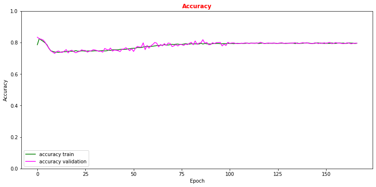
# Plot accuracy metrics vs epoch during the training
# for the proper training dataset and the validation one
plt.rcParams['figure.figsize'] = (13,6)
plt.plot(history.history['accuracy'], label='accuracy train',color='green')
plt.plot(history.history['val_accuracy'], label='accuracy validation',color='magenta')
plt.title("Accuracy",fontsize=12,fontweight='bold', color='r')
plt.ylim([0, 1.0])
plt.legend(loc="lower left")
plt.xlabel('Epoch')
plt.ylabel('Accuracy')
plt.show()
Now let's use our test data set in order to see which are the performance of our model on a never-seen-before dataset and make comparison with what we obtained with the training data set!
# Get ANN model label predictions and performance metrics curves, after having trained the model
y_true = Y_test[:,0]
y_true_train = Y_train_val[:,0]
w_test = W_test[:,0]
w_train = W_train_val[:,0]
Y_prediction = model.predict(X_test[:,0:NINPUT])

# Get precision, recall,
p, r, t = precision_recall_curve( y_true= Y_test, probas_pred= Y_prediction ,
                                 sample_weight=w_test )
# Get False Positive Rate (FPR) True Positive Rate (TPR) , Thresholds/Cut on the ANN's score
fpr, tpr, thresholds = roc_curve( y_true= Y_test,  y_score= Y_prediction, sample_weight=w_test )


Y_prediction_train = model.predict(X_train_val[:,0:NINPUT])
p_train, r_train, t_train = precision_recall_curve( Y_train_val, Y_prediction_train ,
                                                   sample_weight=w_train )
fpr_train, tpr_train, thresholds_train = roc_curve(Y_train_val, Y_prediction_train,
                                                   sample_weight=w_train)
# Plotting the ANN ROC curve on the test and training datasets
roc_auc = auc(fpr, tpr)
roc_auc_train = auc(fpr_train,tpr_train)
plt.rcParams['figure.figsize'] = (10,5)
plt.plot(fpr_train, tpr_train,  color='green', label='NN AUC_train = %.4f' % (roc_auc_train))
plt.plot(fpr, tpr, color='magenta', label='NN AUC_test = %.4f' % (roc_auc))
# Comparison with the random chance curve
plt.plot([0, 1], [0, 1], linestyle='--', color='k', label='random chance')
plt.xlim([0, 1.0]) #fpr
plt.ylim([0, 1.0]) #tpr
plt.xlabel('False Positive Rate(FPR)')
plt.ylabel('True Positive Rate(TPR)')
plt.title('Receiver Operating Characteristic (ROC)',fontsize=12,fontweight='bold', color='r')
plt.legend(loc="lower right")
plt.show()