...
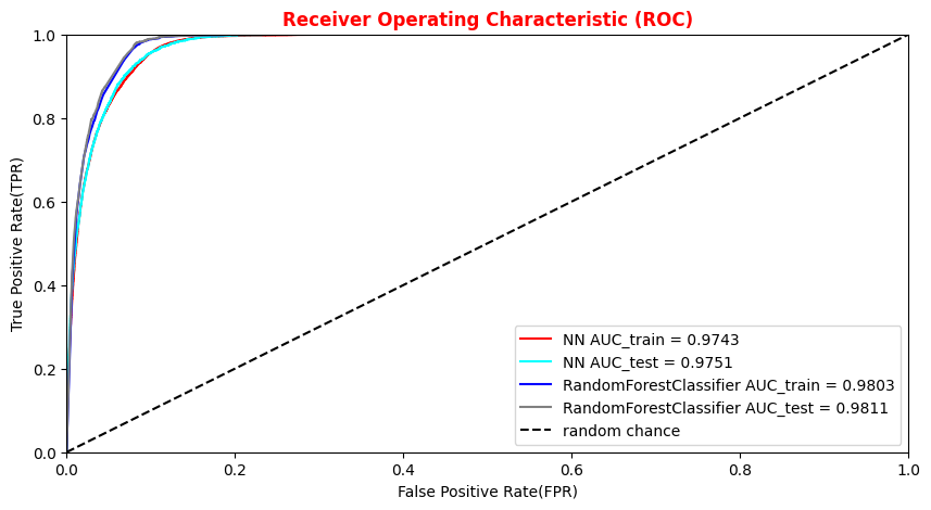
##Superimposition RF and ANN ROC curves
plt.rcParams['figure.figsize'] = (10,5)
plt.plot(fpr_train, tpr_train, color='red', label='NN AUC_train = %.4f' % (roc_auc_train))
plt.plot(fpr, tpr,  color='cyan', label='NN AUC_test = %.4f' % (roc_auc))
#Random Forest 1st method
plt.plot(fpr_train_rf,tpr_train_rf, color='blue', label='RandomForestClassifier AUC_train = %.4f' % (roc_auc_rf_train))
plt.plot(fpr_rf,tpr_rf, color='grey', label='RandomForestClassifier AUC_test = %.4f' % (roc_auc_rf))
#Random Forest 2nd method
#rfc_disp = plot_roc_curve(rfc, X_train_val,Y_train_val,color='brown',ax=ax, sample_weight=w_train )
#rfc_disp = plot_roc_curve(rfc, X_test, Y_test, color='grey',ax=ax, sample_weight=w_test)
#random chance
plt.plot([0, 1], [0, 1], linestyle='--', color='k', label='random chance')
plt.xlim([0, 1.0]) #fpr
plt.ylim([0, 1.0]) #tpr
plt.title('Receiver Operating Characteristic (ROC)',fontsize=12,fontweight='bold', color='r')
plt.xlabel('False Positive Rate(FPR)')
plt.ylabel('True Positive Rate(TPR)')
plt.legend(loc="lower right")
plt.show()
Plot physics observables
We can easily plot the quantities (e.g. ,
,
,
,
) for those events in the datasets which have the ANN and the RF output scores greater than the chosen decision threshold in order to show that the ML discriminators did learned from physics observables!
The subsections of this notebook part are:
- Artificial Neural Network rates fixing an ANN score threshold from dataframe
- Exercise 2 - Random Forest rates fixing a RF score threshold from dataframe
- Plot some physical quantities after that the event selection is applied
import matplotlib as mpl
import matplotlib.pyplot as plt

# Define a data frame for low level features
data = df_all.filter(NN_VARS)
X_all   = np.asarray( data.values ).astype(np.float32)
#Use it for evaluating the NN output score for the entire data set
Y_all = model.predict(X_all)
Artificial Neural Network rates fixing an ANN score threshold from dataframe
Let's fix a cut (looking at the performance of our models in terms of the previous purity*efficiency metrics plot) on our test statistic (ANN score and RF score) to select mostly VBF Higgs production signal events!
# Add the ANN prediction array 'NNoutput'column to the complete dataframe in order
# keep the information about the ML algorithm prediction for every event in the whole dataset
df_all['NNoutput'] = Y_all
# Selects events with NNoutput > cut (and RFoutput > cut_rf later on)
cut_dnn = 0.6
df_sel   = df_all[(df_all['NNoutput'] >= cut_dnn)]
df_TP    = df_all[(df_all['NNoutput'] >= cut_dnn) & (df_all['isSignal'] == 1)]
df_unsel = df_all[(df_all['NNoutput'] < cut_dnn)]
df_TN    = df_all[(df_all['NNoutput'] < cut_dnn) & (df_all['isSignal'] == 0)]

TP = len(df_TP)
FP = len(df_sel) - TP
TN = len(df_TN)
FN = len(df_unsel) - TN

truepositiverate = float(TP)/(TP+FN)
fakepositiverate = float(FP)/(FP+FN)
print('ANN score cut chosen:%.4f' % cut_dnn)
print("TP rate = %.4f"%truepositiverate)
print("FP rate = %.4f"%fakepositiverate)
ANN score cut chosen:0.6000
TP rate = 0.9494
FP rate = 0.9647
Exercise 2 - Random Forest rates fixing a RF score threshold from dataframe
You can do the same steps for the Random Forest algorithm!
Y_all_rf = randomforest.predict(X_all)
df_all['RFoutput'] = Y_all_rf

cut_rf = 0.6
df_sel_rf   = df_all[(df_all['RFoutput'] >= cut_rf)]
df_TP_rf    = df_all[(df_all['RFoutput'] >= cut_rf) & (df_all['isSignal'] == 1)]
df_unsel_rf = df_all[(df_all['RFoutput'] < cut_rf)]
df_TN_rf    = df_all[(df_all['RFoutput'] < cut_rf) & (df_all['isSignal'] == 0)]

TP_rf = len(df_TP_rf)
FP_rf = len(df_sel_rf) - TP_rf
TN_rf = len(df_TN_rf)
FN_rf = len(df_unsel_rf) - TN_rf


truepositiverate_rf = float(TP_rf)/(TP_rf+FN_rf)
fakepositiverate_rf = float(FP_rf)/(FP_rf+FN_rf)
print('RF score cut chosen: %.4f' % cut_rf)
print("TP rate = %.4f"%truepositiverate_rf)
print("FP rate = %.4f"%fakepositiverate_rf)
RF score cut chosen: 0.6000
TP rate = 0.9812
FP rate = 0.9874
Plot some physical quantities after that the event selection is applied
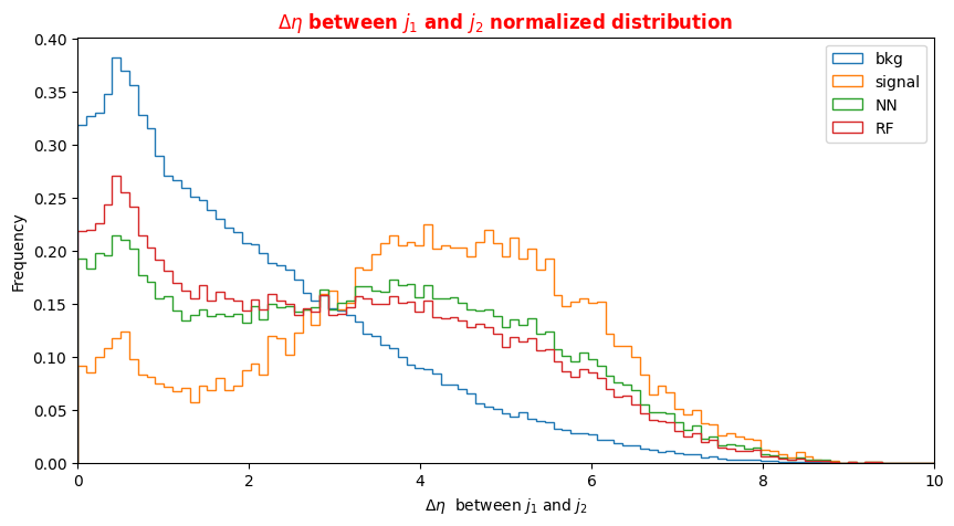
Note that we have not used the low level features in the training phase of our models,they behaved as spectator variables. We will plot the distribution of events considering their actual label (in the legend signal and background) and the distributions for the two classes that our classifiers has built after having fixed a threshold on their output scores.
Question to students: look at the plots and comment them. Taking into account the physics processes involved, did you expect these distributions?
Hint: The data set are simulated events in which Higgs boson is produced with a mass of 125 GeV. Therefore, we expect to see one on-mass-shell Z boson and another off-mass-shell Z boson.
# Plot high level variables for signal, background and NN/RF selected events

plt.xlabel('$\Delta \eta $  between $j_1$ and $j_2$')
X = np.linspace(0.0,10.,100)
plt.rcParams['figure.figsize'] = (10,5)
# Plot bkg events
df_all['f_deltajj'][(df_all['isSignal'] == 0)].plot.hist( bins=X, label='bkg',histtype='step', density=1 )
# Plot signal events
df_all['f_deltajj'][(df_all['isSignal'] == 1)].plot.hist(bins=X, label='signal',histtype='step', density=1)
# Plot selected events by the ANN
df_sel['f_deltajj'].plot.hist(bins=X, label='NN',histtype='step', density=1)
# Plot selected events by the RF
df_sel_rf['f_deltajj'].plot.hist(bins=X, label='RF',histtype='step', density=1)
plt.legend(loc='best')
plt.title('$\Delta \eta $ between $j_1$ and $j_2$ normalized distribution',fontsize=12,fontweight='bold', color='r')
plt.xlim(0,10)
plt.show()
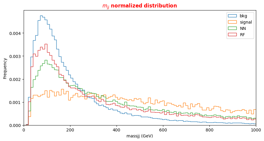
# Plot  dijets mass for signal, background and NN/RF selected events
plt.xlabel('massjj (GeV)')
X = np.linspace(0.0,1000.,100)
plt.rcParams['figure.figsize'] = (10,5)
df_all['f_massjj'][(df_all['isSignal'] == 0)].plot.hist(bins=X, label='bkg',histtype='step', density=1 )
df_all['f_massjj'][(df_all['isSignal'] == 1)].plot.hist(bins=X, label='signal',histtype='step', density=1)
df_sel['f_massjj'].plot.hist(bins=X, label='NN',histtype='step', density=1)
df_sel_rf['f_massjj'].plot.hist(bins=X, label='RF',histtype='step', density=1)
plt.title('$m_{jj}$ normalized distribution',fontsize=12,fontweight='bold', color='r')
plt.legend(loc='upper right')
plt.xlim(0,1000)